Have you ever been on a meeting with the design team, feeling as if they speak a completely different language? You hear the same words you’ve heard many times before, but, frankly, you are never 100% sure what each of them means.
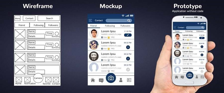
Wireframes, mockups, and prototypes are sometimes confused. All of them are some sort of visualization of the product, but each one has its specifics and objectives.
Let’s go through all of them and find out how to recognize them at a glance and confidently decide which one you need in any particular situation. We’ll go in order of the product design process, starting with wireframes — that part of UX design that can be done with a pencil and notebook.
Wireframe
To instantly recognize a wireframe when you see it, you have to remember just one thing: it’s grey. Wireframes are always created in greyscale, using the most basic shapes, fonts, and designs. No images, no animation. Some designers would use one accent color, but all white/grey/black wireframe is a classic.
Next step, why do you need a wireframe?
Why do designers intentionally avoid any distinctive UI elements? This is because the main purpose of wireframes is to build a structure. When architects plan a building, they start with boring schemes, not with sculptures on the facade. The same goes for UX architects and designers.
Wireframes are made to place all the main content blocks and website sections in a clear structure and think of how users would interact with them. It is intentionally kept very basic, so that:
- bright design elements don’t distract team members from the structure
- the team can discuss and make changes without fuss: those basic “designless” wireframes are very fast to edit.
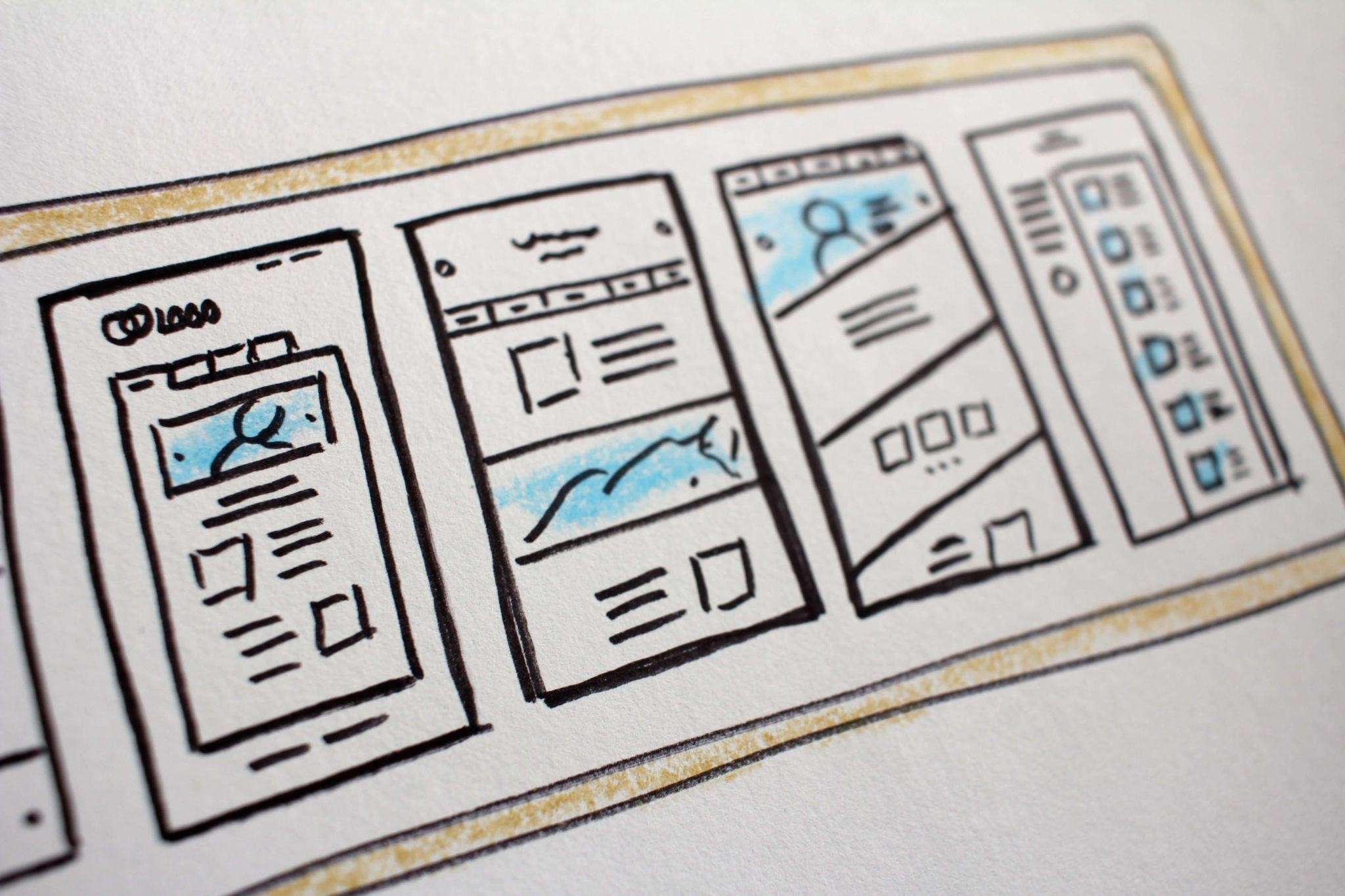
There are two types of wireframes: low-fidelity, the most basic one, and high-fidelity. Low-fidelity wireframes can be even sketched on a piece of paper during brainstorming.
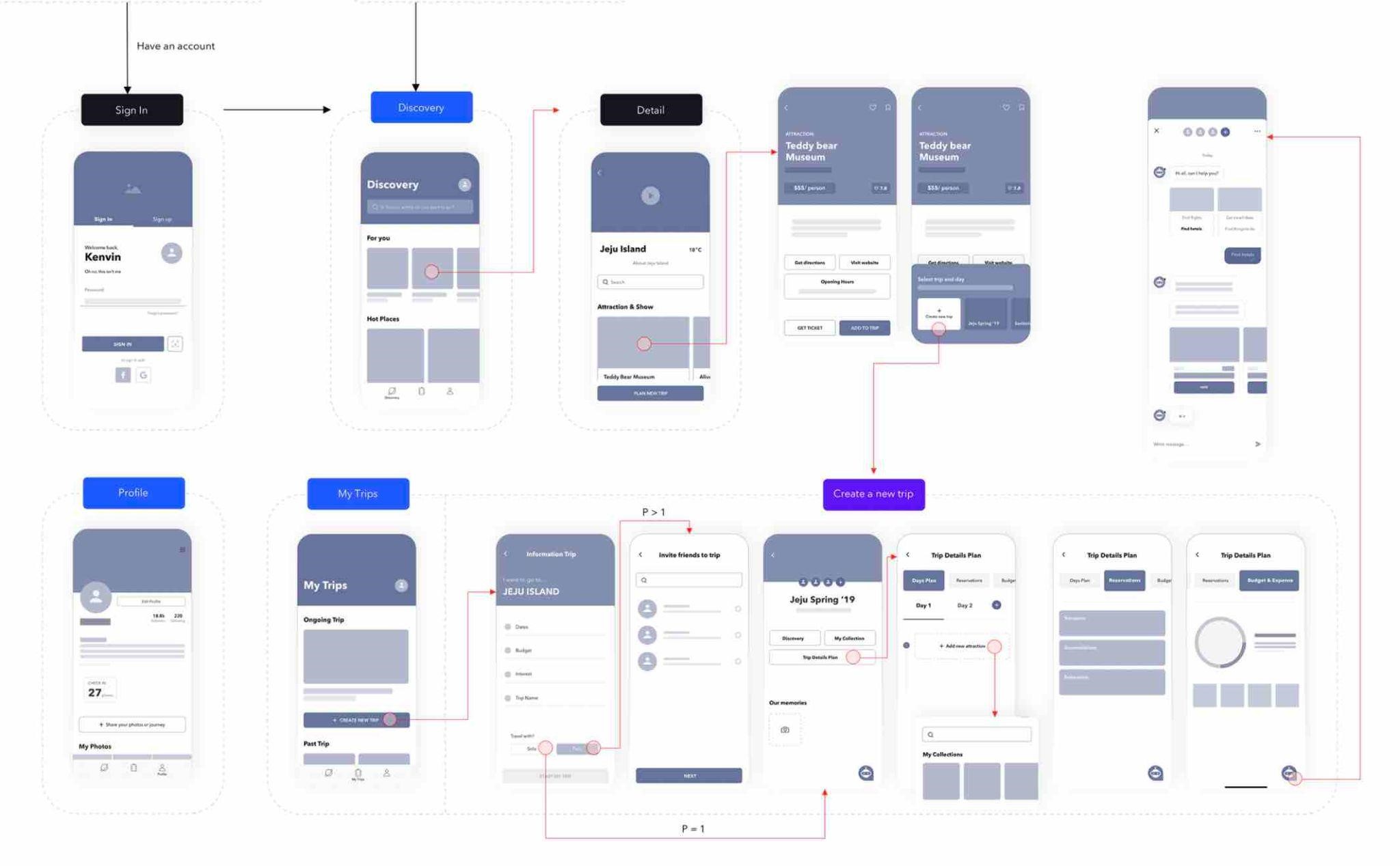
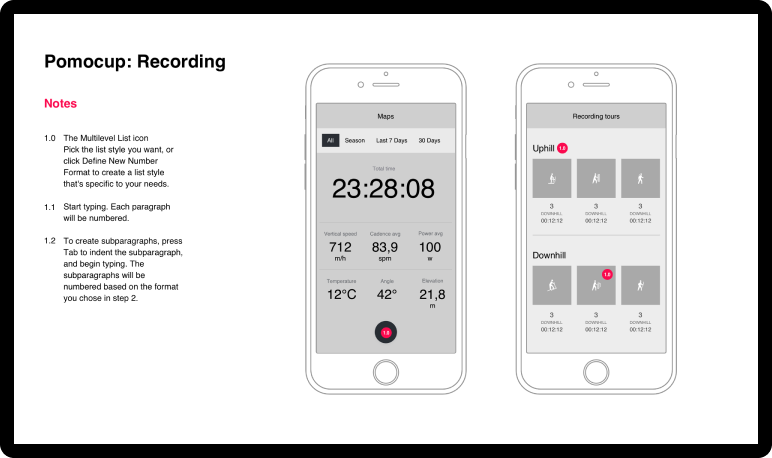
High-fidelity wireframes have to be done in a graphic editor (UX designers typically use the same tool they use for actual UI design, like Figma). They often have more content, and explanations on how different parts of the interface interact with each other.
Wireframes are built at the initial stages of product development. This is a good moment for all the team to work together and get aligned in how they see the product.
You need a wireframe if…
- You are building a product from scratch
- The product is complex and you have to work on the structure
- Team members need to build product architecture all together
Mockup
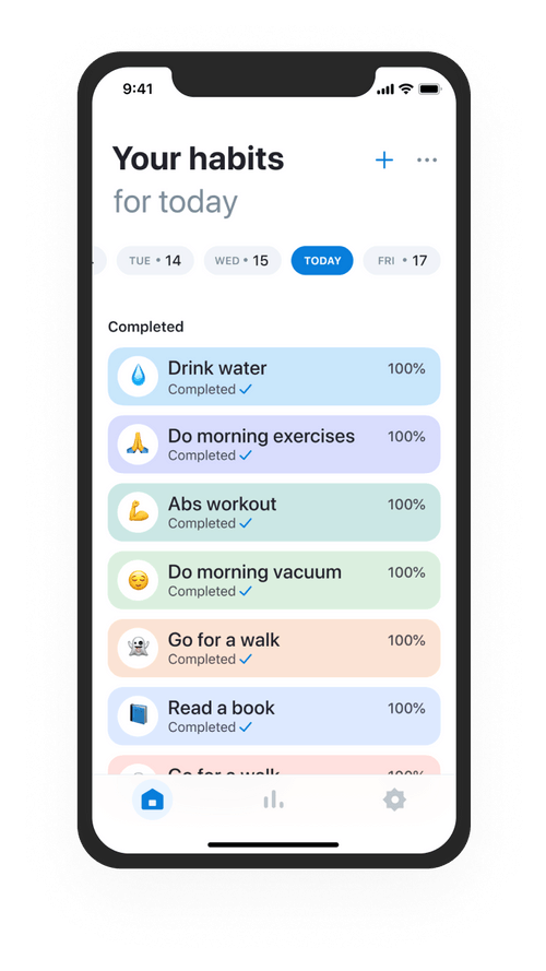
A mockup is a visual image of a screen or a page, looking the same as a user will see it. Unlike wireframes, mockups can have colors, images, display fonts, and so on.
Mockups come much later in the design process when both information architecture and user interface are ready. A mockup can be a basis for developers’ work. Also, mockups can be used for user testing and presentations.
You need a mockup if…
- You want to test visual aspects of UI with users
- The client has to make the decision about the look of the product
- The product isn’t fully developed yet but you need nice images for the marketing campaign
Note that designers also call mockup a picture of a product “in real life”, for example, a smartphone lying on the table with the app screen on it, or a cup with the company logo on it. All those extra clean product photos we see in e-commerce shops are often just generic images where designer inserts an image or logo.
Prototype
At the first glance, the mockup and prototype look similar. However, there is one big difference: prototypes are clickable. They are made to simulate user experience.
The prototype is the closest representation of the real product, both visually and functionally. By clicking through the screens, the user can understand how the app works, interact with it, and perform the tasks of usability tests.
Testing a product is a good idea at any stage of the design process, but prototypes are just perfect for user testing. That is where designers find out that the button is too narrow for the finger and the “undo” option is needed.
Some time ago making a prototype required knowledge of advanced instruments, but now design tools have evolved so that prototyping has become accessible for most UI/UX designers. Figma, the most popular UX design tool, has everything you need for that.
You need a prototype if…
- You want to present the product to the investors and show how it works
- You want to run usability testing properly
- The product needs to be fine-tuned before the development stage
Prototypes save a lot of effort when communicating the properties of the product to managers, marketers, sales, investors, users… As Tom and David Kelley from IDEO said, “If a picture is worth 1,000 words, a prototype is worth 1,000 meetings.”
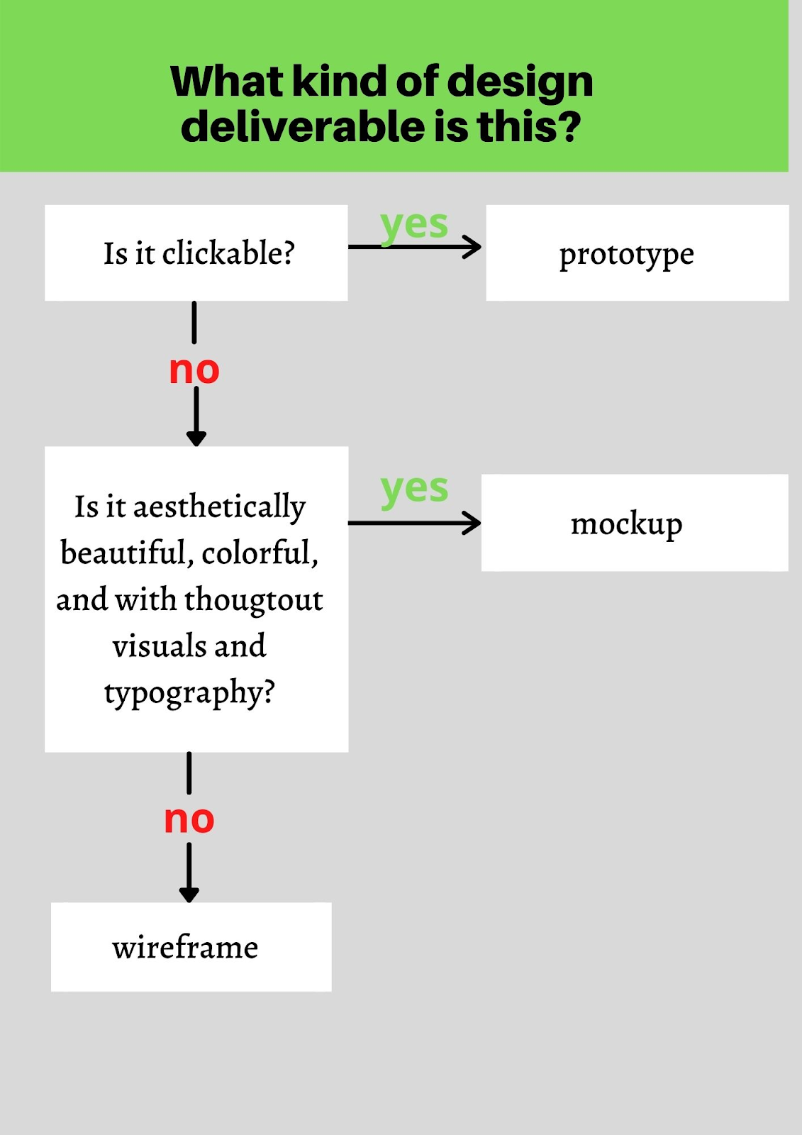
By asking yourself these two easy questions, you’ll never confuse wireframes, mockups, and prototypes again:
Summary
Wireframe, mockup, and prototype are different kinds of visualization of the product, typically used during the design process. When the product is developed from scratch, working all the way from wireframes to prototypes is necessary. However, in some cases, you may opt for one of these that would suit a particular situation.
When you want to add a new function to an already existing product, you can skip the wireframes easily. The same goes for situations when the budget, time, or other resources are limited: designers may go just with the mockups.
On the other hand, skipping wireframes to save time may end up in a bigger time loss at the final stages. If there were some errors with the structure, solving them at the very beginning is much faster and cheaper than if they were noticed at the final stages.
All in all, each product is special and requires an individual approach. This text just a general overview. If you want to learn more about wireframes, mockups, and prototypes, you can read this blog post by Eleken.
