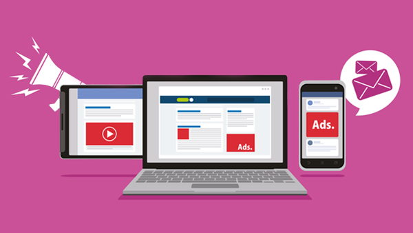
HTML5 has revolutionised the way advertisers use display ads. Unlike the flash plug-ins, HTML5 banners enable the designers to get more creative with the banners. Now, one can animate the banners, apply transitions to them, and also scale them for multiple devices.
Moreover, it is effortless to create HTML5 banners as most software already have a preset template. Your job is to edit the information in the template, and within minutes, your animated banner ads are ready to be used.
But, making responsive ads alone does not assure high CTR (click-through rate). These ads have to be designed carefully following the basic rules of design.
Here are some general tips for designing better banner ads
1. Use the most effective banner sizes
Banners can be as small as a single pixel or can be made to cover the entire screen. However, as per the data by Google Adsense, the most effective banner sizes are:
- 728x98px -This is a leaderboard banner size,
- 300x600px – This banner covers half the page vertically
- 300x250px – A medium rectangle banner, the best size if you wish to put up multiple banners
- 336x280px – Large rectangular banner
These sizes are in pixels, as denoted by ‘px’. If you are not familiar with the pixel sizes and measurements, many tools are available for conversion from pixels to inches.
2. Maintain content hierarchy
Effective banner ads aim to strike a balance between aesthetics and information. They increase your brand awareness and help drive traffic to your website. There are three components to any banner design that must always be in the hierarchy.
- The company logo – It must always be included in every banner to create and maximise brand recognition.
- The proposition – This component of the banner must showcase the value proposition. That is, you must use it to convey to your audience what product or service you are offering. This can be done by creative copywriting or by offering attractive deals to the audience. The proposition must be the centre of attraction of your banner design.
- Call to action – The CTA (call to action) is a text that entices the audience to perform the desired action. Phrases like ‘ click here to redeem the offer’ can be deemed as CTAs.
3. Use buttons effectively
The buttons on the banner redirect the audience to the target URL when clicked. Such buttons can help drive up your CTR. Most designers often do not use the buttons and depend only on CTAs to motivate the audience to click on the banner.
However, when you create HTML5 banners, the combination of buttons and a CTA works the best. So, ensure your buttons are placed neatly at the end of your banner and have contrasting colours for greater visibility.
4. Use clear fonts
The aim is to make the banner instantly readable; while the structure of the banner and copywriting play a significant part, using the right font is also important. So, stray away from using confusing graffiti-like fonts. Use fonts that are easy to read and resonate with your brand’s font family.
5. Be consistent
The banner ads redirect the audience to your landing page. So, the design of the banners must be in sync with your brand’s current designs. Use the same design language, colour scheme, fonts, and other components to design ad banners. Inconsistency in designs may confuse your target audience.
Remember, aside from following the basic guidelines, it takes a significant amount of A/B testing to determine what works the best for your banners.
