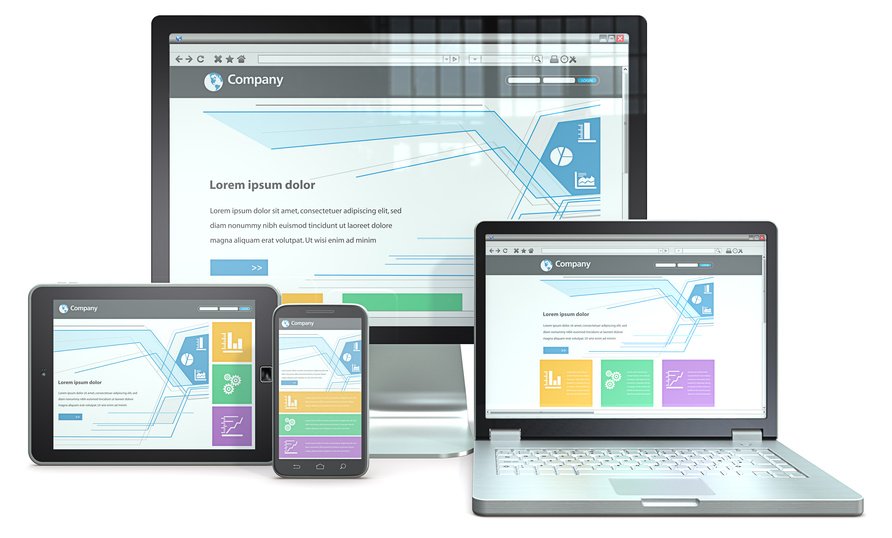
Web design is more accessible than ever with user-friendly CMSs and various web building tools available on the market. That doesn’t mean, however, that everyone can build a professional website overnight. Even with the best tools, it’s still possible for beginners to make crucial design mistakes that could not only affect their users’ experience but affect the site’s performance as well. Here are a few essential web design tips beginners should live by.
Find a Good Web Builder
It all starts with picking the right web builder for you. You should find a web builder with a user-friendly interface, drag and drop features that allow you to add elements easily, a wide variety of templates, and make sure that the templates they offer look great on any platform. If you’re strapped for cash, you can find a free website builder with all these features. You should also make sure that the templates are SEO optimised since it can be difficult as a beginner to get SEO right.
Plan your Site on Paper
Before you start building your site, you should first put it down on paper. You should have an idea of what the navigation bar will look like, if you’d like an animation or a widget on the first page, the type of layout that you want, navigation links, etc. Trying to start right on the builder or on Photoshop might be difficult to grasp and much more difficult than on paper. If you aren’t familiar with layouts yet, look for other sites in your niche and pick a few that you like. You’ll then be able to pattern your site after them.
Have a Clear Hierarchy
Your users should be able to see your most important content the minute they get to your site. Everybody has an intention when they build a site, whether you want customers to contact you for a quote, get them to subscribe, or buy one of your products. This information should be “above the fold” as it is often said in web design jargon. That means that it should occupy the top space on the first page and without the user needing to scroll down.
A current trend right now in web design is to have a huge “hero” image on the first page. This is usually a full-screen background picture with straight forward text over it and a call to action. This is a great way to grab your users’ attention and convey the purpose of your site immediately.
Understand Good Typography
Forget flash animations and cool colour palettes, the fonts you use and how you use them will have a much bigger impact on your web design. The text is the most essential part of your website, so you have to get it right. Your subheadings, headings, and body text should have a natural flow and they should be distinct from each other.
When choosing fonts, make sure that they’re legible and try to avoid fancy flowery fonts. Also, make sure that your body text is big enough, around 16px if possible. And, make sure to not overdo it with the fonts and don’t go for more than two fonts. Make sure that you break your paragraphs correctly and give enough margin and top padding to your subheaders to form clear breaks in your text.
Conclusion
While web design has been simplified over the years, you still need to use sound design principles to make sure that you get the results that you want. Make sure that you follow these few tips if you want to create a high performing, professional, and attractive website.
