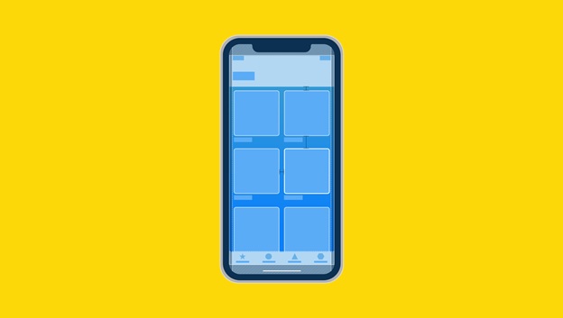
200 000 new applications are recorded in the App Store and Google Play every month. A well-thought-out apps interface helps to engage users’ consideration and obtain trading advance. Even beginners have heard about app UI design. But still not everyone knows how to implement this approach in practice. In this article, we’ll show you how to create an attractive app interface that can increase conversions.
How is the design of mobile applications created?
The app designer is responsible for the emotions of using the product. To accomplish this task, the specialist must:
- Create an attractive visual appearance;
- Be able to identify user needs through research;
- Build a navigation model (how application screens are linked);
- Design the interface (prioritize the hierarchy of components).
Coloristics and Typography
Many developers have a lot of experience and good intuition. However, knowing the basics greatly simplifies the choice of color scheme and saves time. There are many concepts for choosing color harmony. There is such a thing as Itten’s color wheel. It contains 12 colors. It is these colors that are considered the most familiar and easy for human perception.
Color models already exist to help designers:
- Monochrome colors.
- Similar colors.
- Complementary.
- Close and complementary.
- Twin complementary.
- Triadic colors.
The presence of pure white or pure black in the color scheme of the main six harmonies enhances the contrast, respectively, the interface will be very lively, if you do not overdo it with the color coverage area. Otherwise, excessive color activity will be annoying.
Do you want to draw attention to the color and make the site as bright and expressive as possible? Use contrasting colors. Add some pure white or velvet black. Make a large menu and a 3D font. It’ll be enough.
Monochrome combinations are perfect for a calm interface of a serious project. And, an important rule in the color matching of the interface: minimalism. Five colors is the maximum limit. Don’t overload your site with all the colors of the rainbow.
Composition
Cognitive load is the effort that users make to recognize an object, the logic of its work, and decide on further actions. There are visual and motor loads as well. People don’t want to make an efford using app or web-site. So the composition should be simple. Apple a minimum of swipes and taps.
Tools
From graphic editors, Figma, Sketch or Adobe XD are now popular.
Figma
Cross platform online editor that works on Windows, macOS, Linux. The whole team can work in it, including with customers. Free for one user and paid for working with a team if you need to see all the team’s actions, not just the last 30 days. Learn more about Figma and UI design with Designership.
Sketch
Paid graphics editor for macOS. The advantage of Sketch is that it has been on the market longer than Figma, so in some cases there are more opportunities and integrations for it. But if you are a freelancer, working with clients will be tricky as it is not a cross-platform tool. You can work offline in Sketch.
Adobe XD
Adobe application for designing interfaces. The pros and cons are similar to Sketch, except that Adobe XD has the ability to create voice prototypes using Amazon Alexa. XD is noticeably less popular compared to Figma and Sketch.
Graphic editors are quite similar, so if you master one tool, then learning another will not take much time.
Miro
In this service, it is convenient to do brainstorms, discussions, work out hypotheses, design navigation using a mindmap and create a Customer Journey Map.
Prototyping services
In addition to built-in prototyping in Figma, Sketch or Adobe XD, they additionally use solutions such as InVision, Marvel, ProtoPie, Flinto, Principle for Mac. Cost of app design directly depends on the functionality of the product. The more elements, the more difficult the development. Accordingly, the price will rise.

